Boyne Resorts
Building a scalable multi-brand design system across 18 resort experiences
Boyne Resorts operates 18 destination properties across North America, each with its own brand identity, audience, and seasonal offerings. The challenge was to create a unified digital system that could scale across all properties while preserving individual brand expression.
I led the architecture and implementation of a multi-brand, token-driven design system, working closely with design and engineering teams to create a foundation that balances consistency with flexibility.
Problem
Each resort operated with its own fragmented design approach:
Inconsistent UI patterns across properties
No shared component system or scalable structure
High design and development overhead for updates
Difficulty maintaining brand distinction within a shared platform
This resulted in fragmented experiences and made it difficult to scale features across properties.
Approach
We needed a system that could:
Support multiple brands without duplicating components
Standardize core UX patterns across all resorts
Enable faster design and development workflows
Maintain flexibility for brand-specific expression
The key was to decouple structure from styling, allowing flexibility without sacrificing consistency.
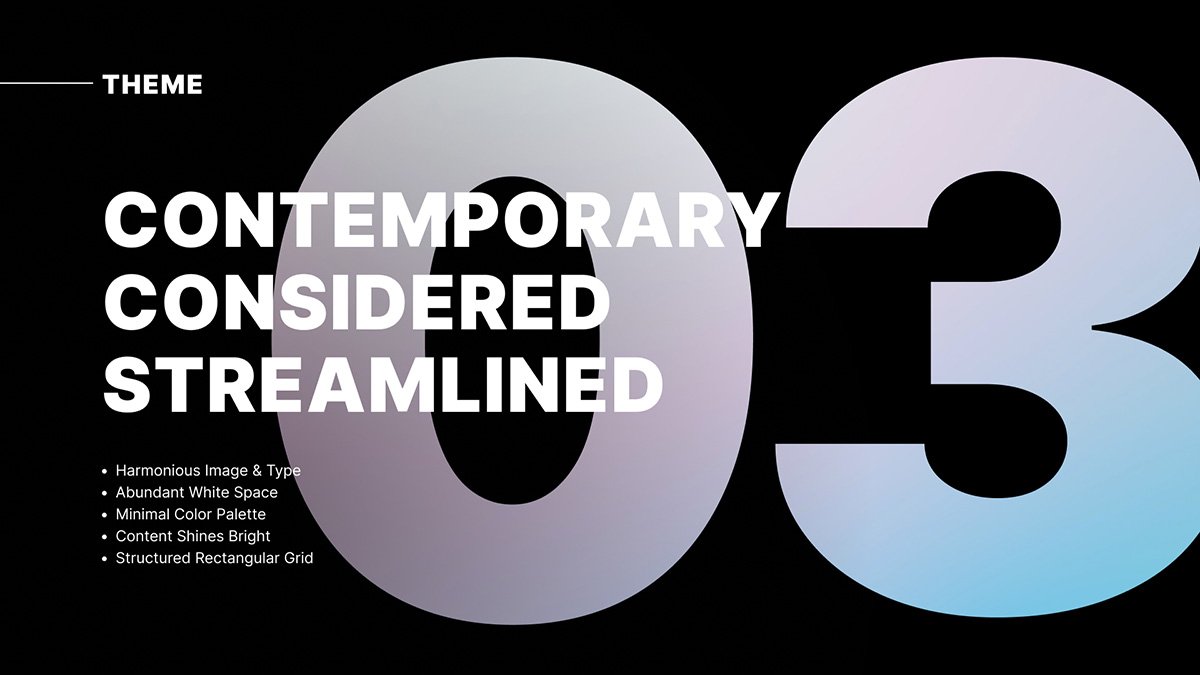
Solution
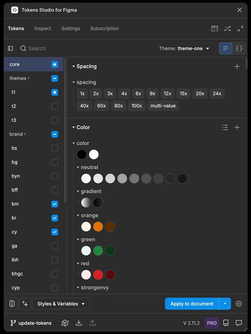
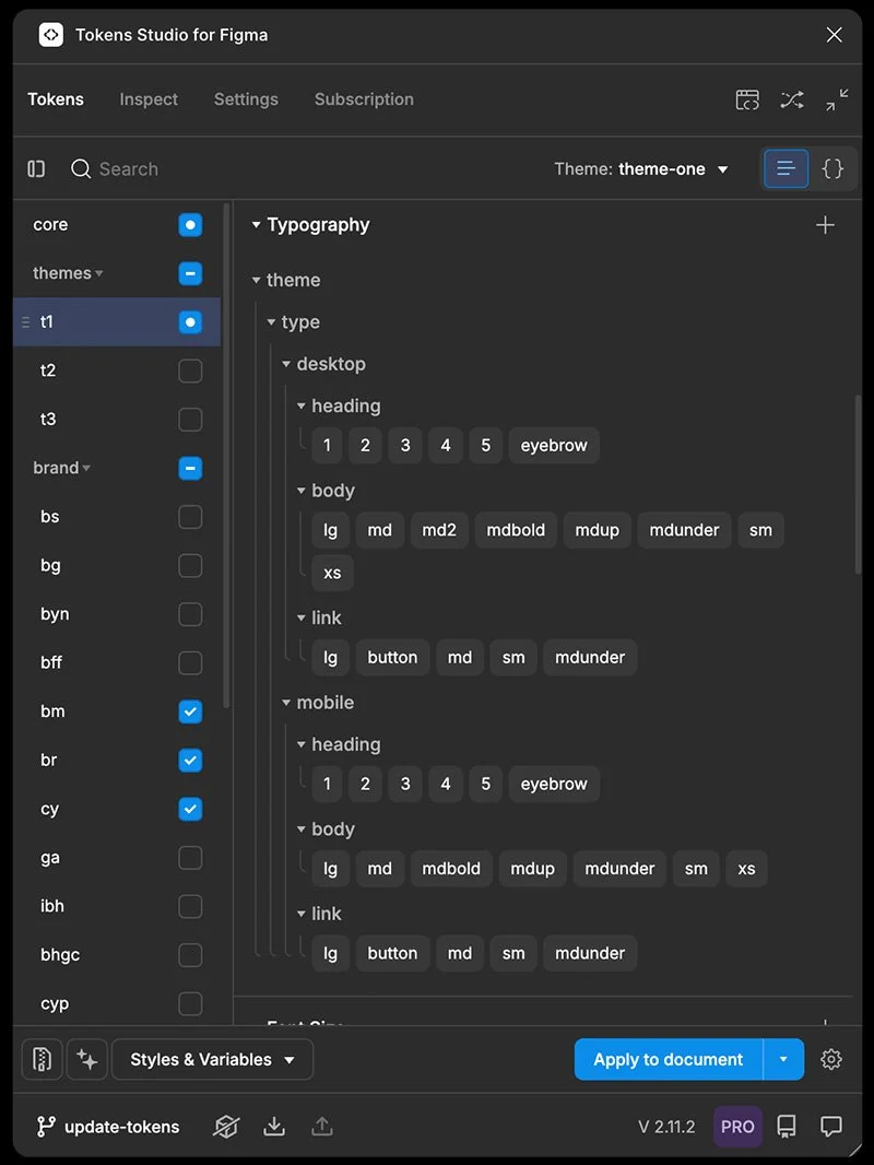
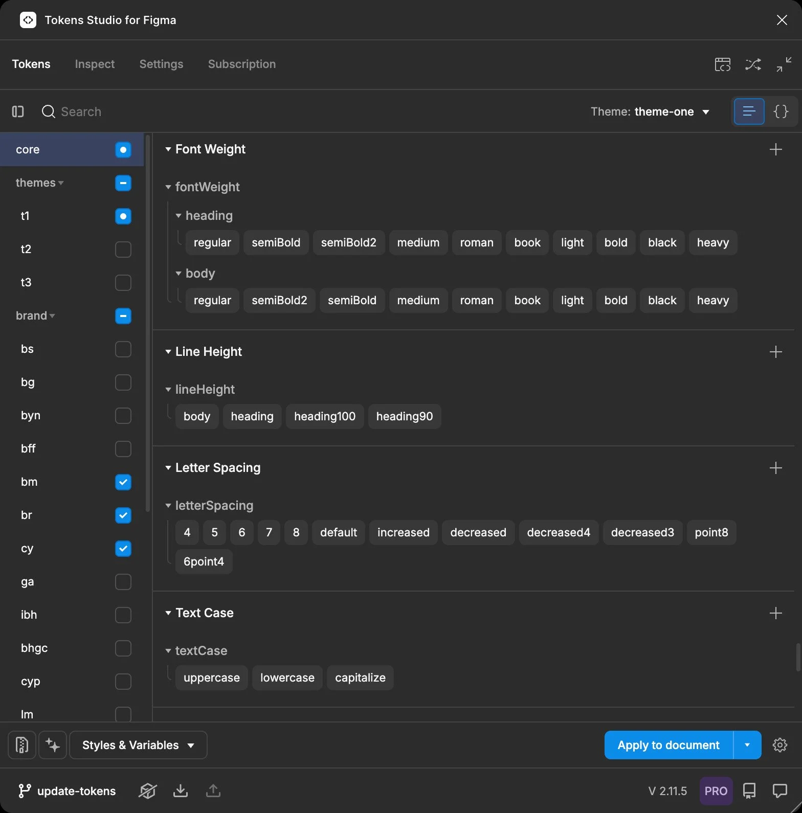
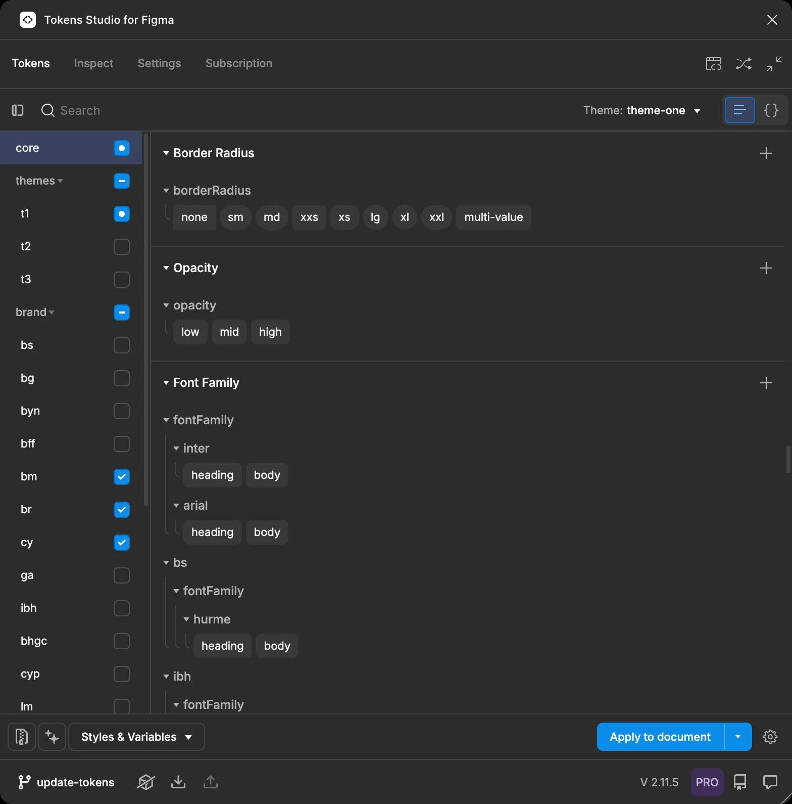
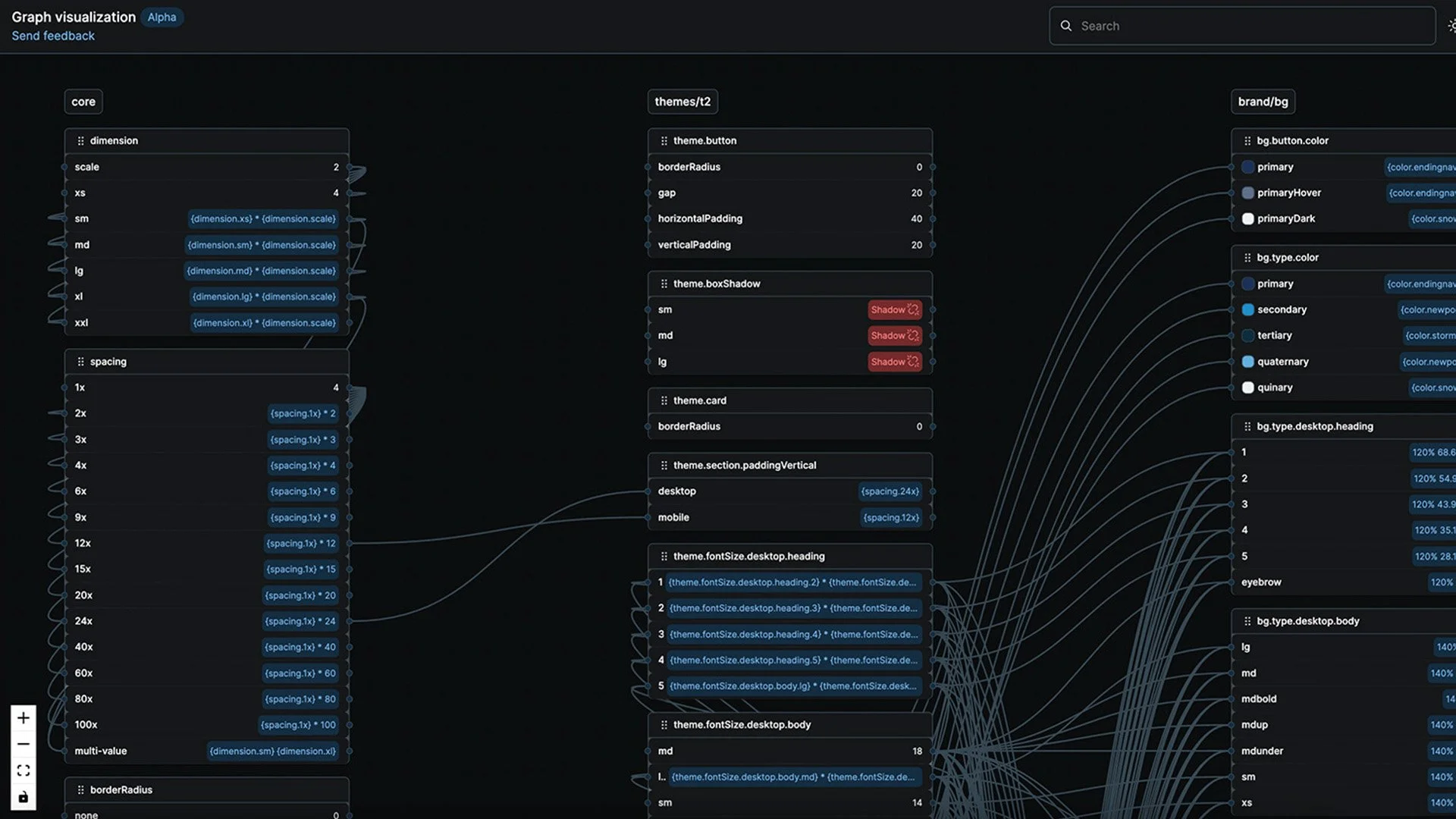
Token-driven system architecture
I structured the system using design tokens to separate:
Core system tokens
Foundation, Dimensions,
System, Utility
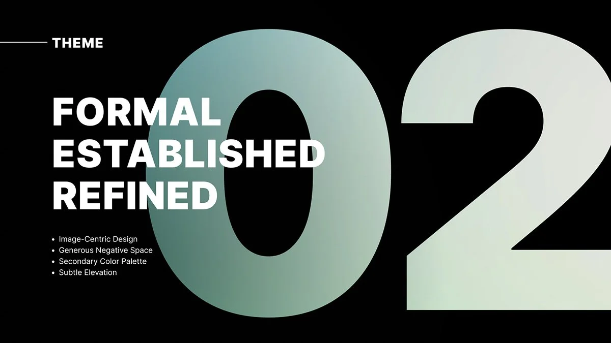
Theme level tokens
Spacing, Typography scale, Layout rules
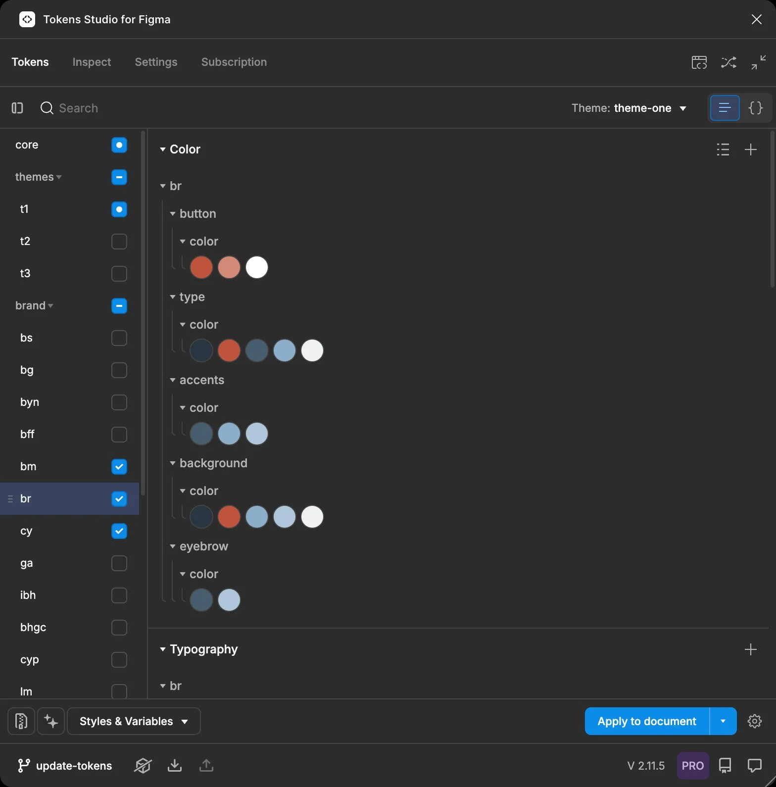
Brand tokens
Color, Imagery, Tone
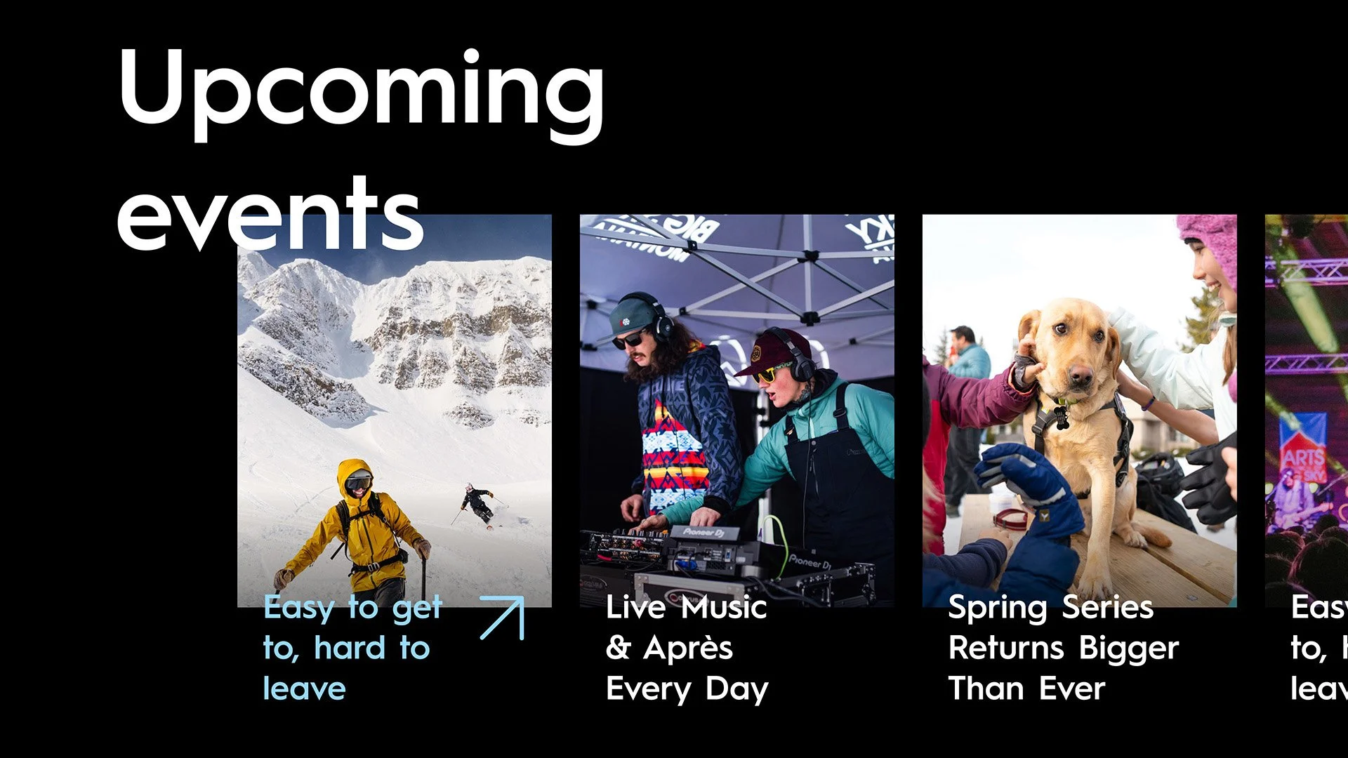
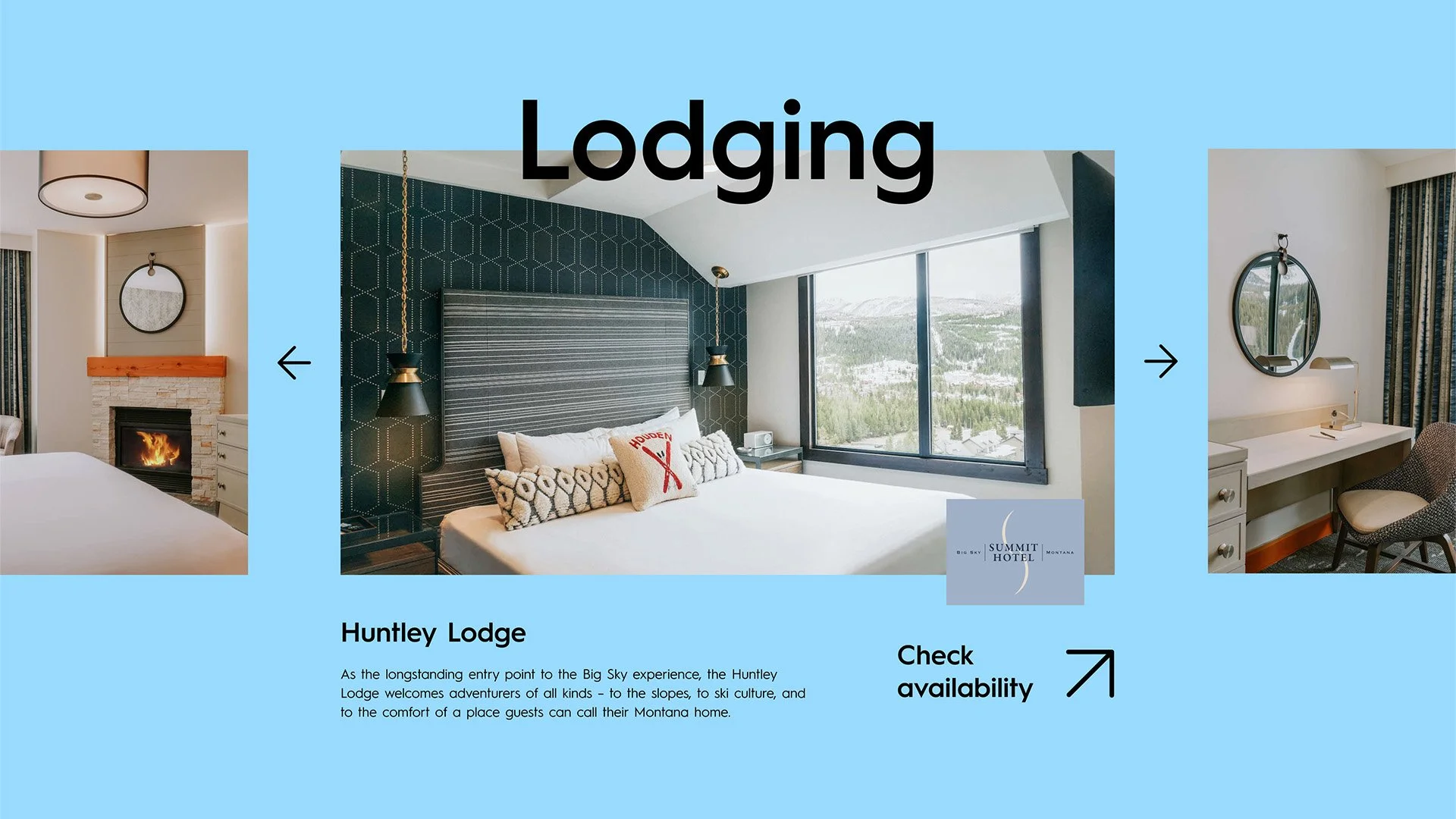
Modular component system
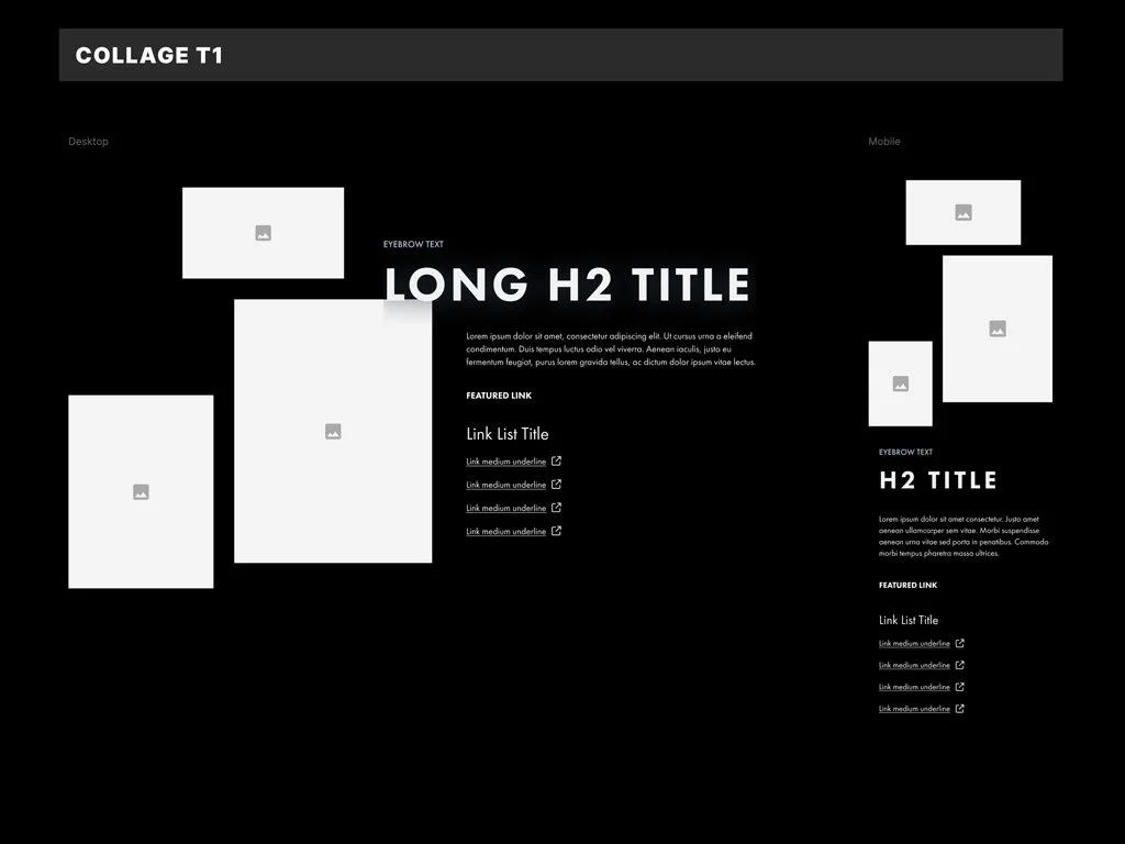
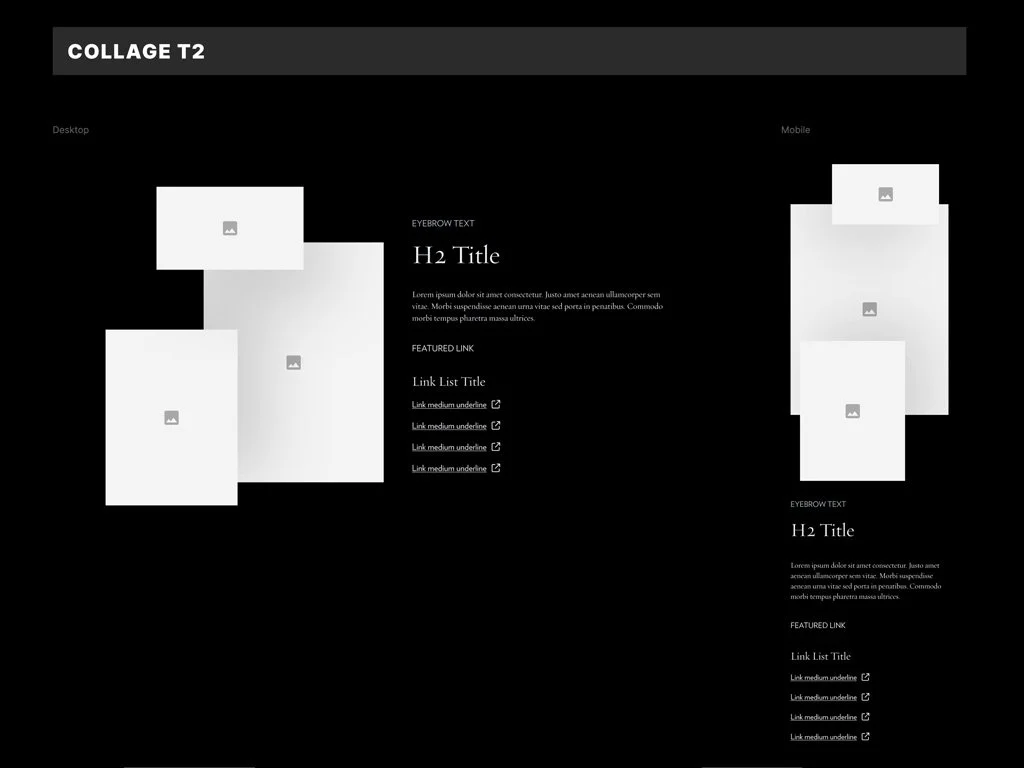
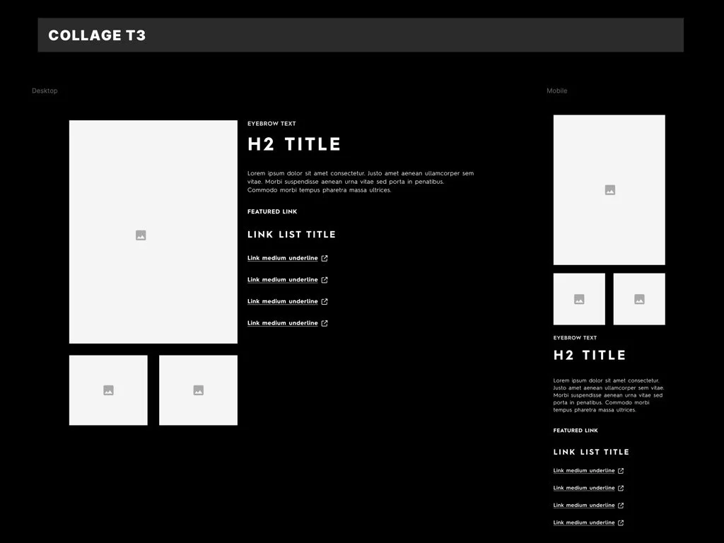
Defined a modular component system designed for reuse across multiple content types and resort needs.
Components were built with:
clear states and variants
responsive behaviors
flexible content structures
This allowed teams to assemble complex layouts quickly while maintaining consistency across the platform.
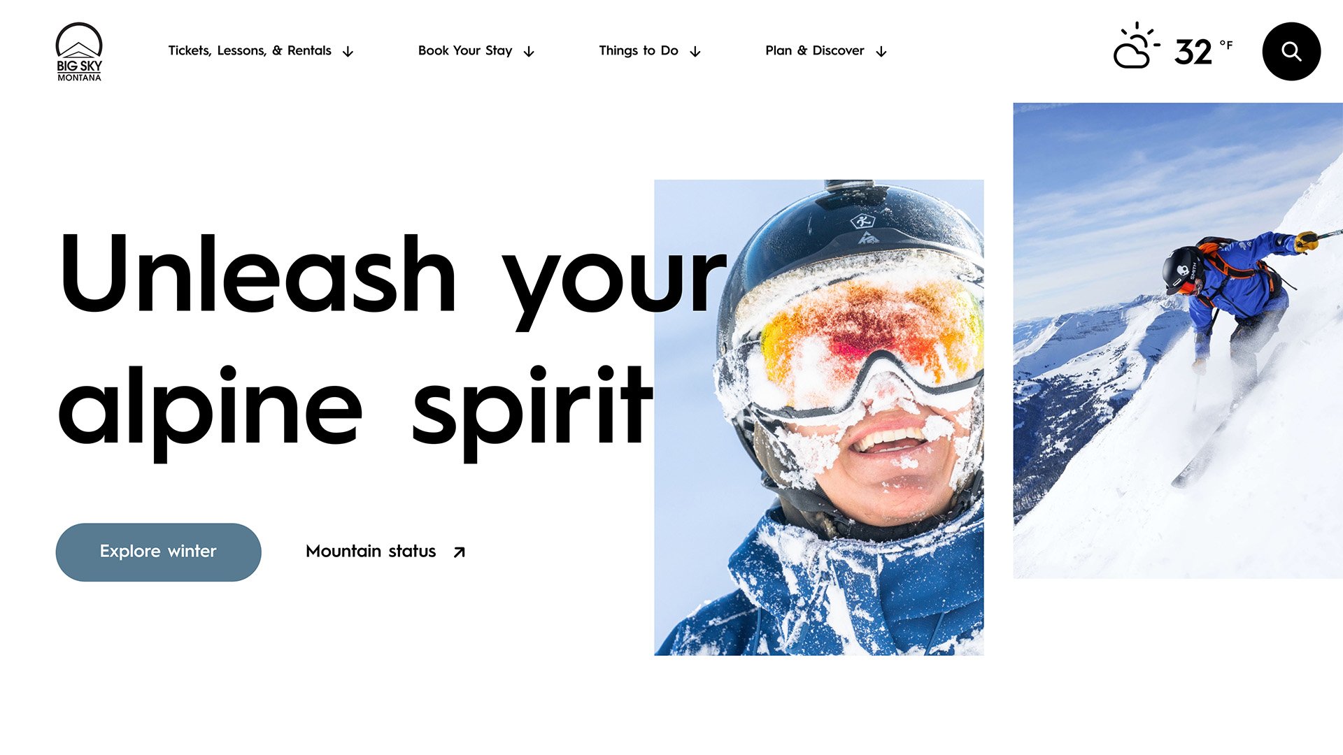
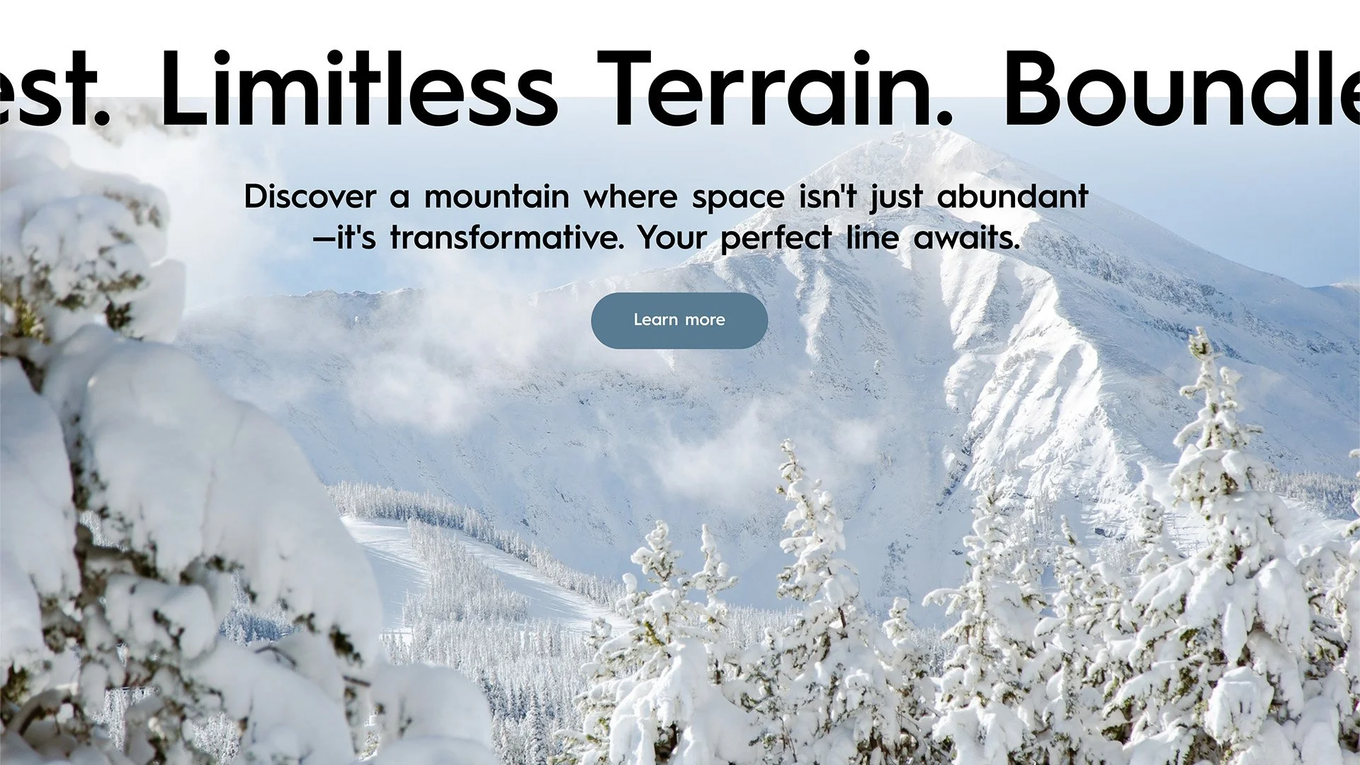
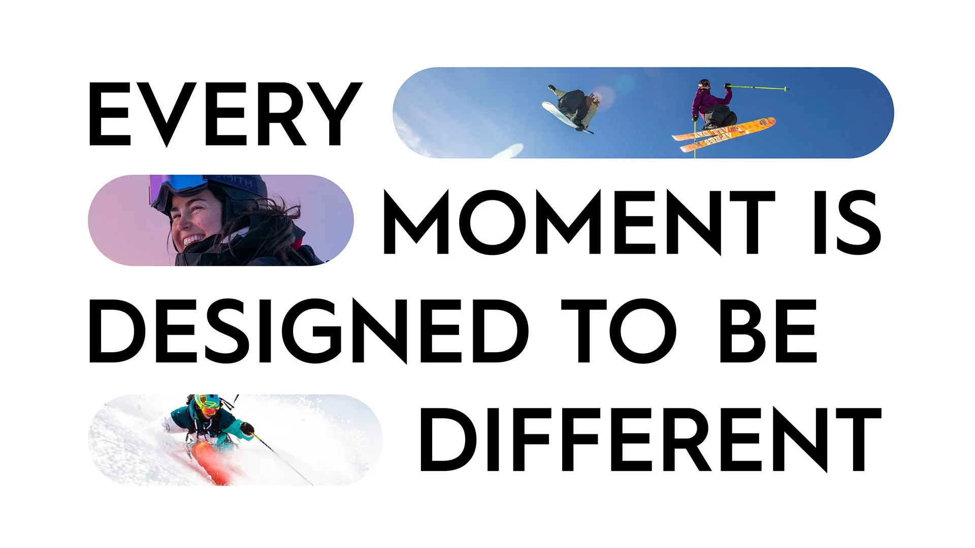
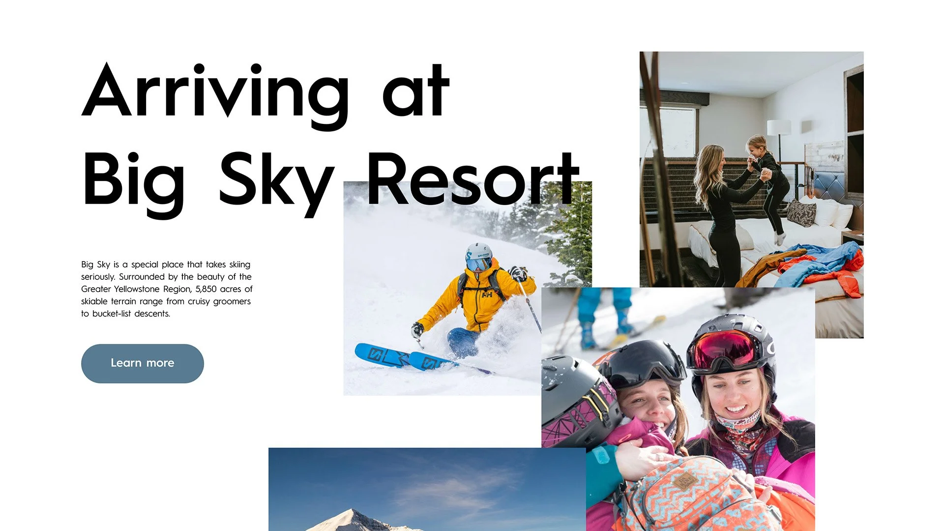
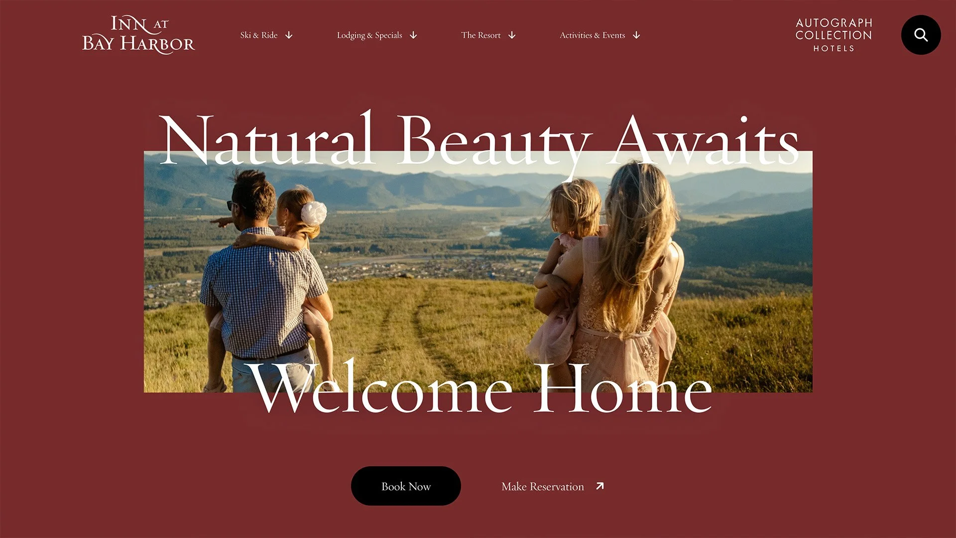
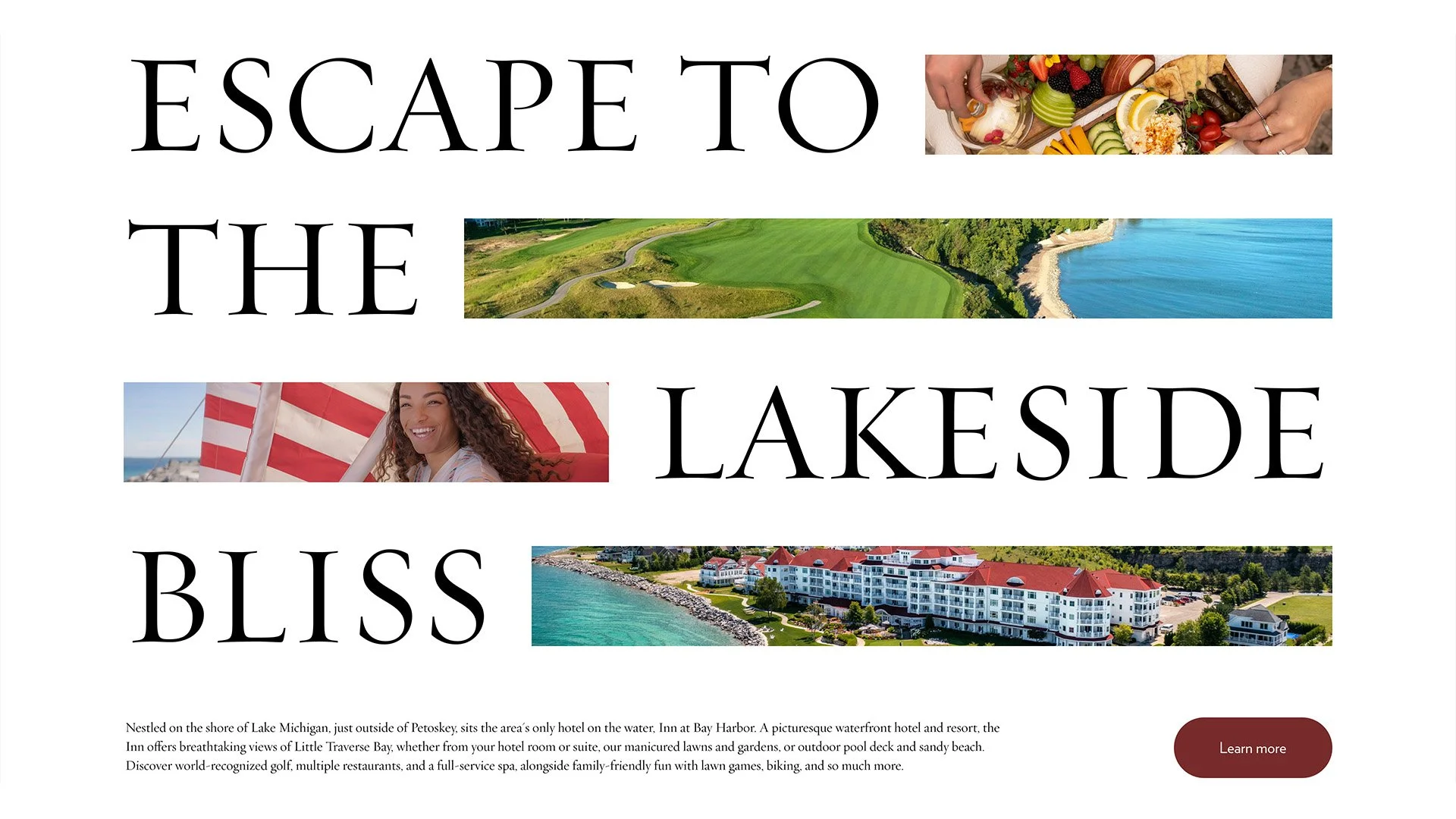
One System, Multiple Identities
The same core layout and component system adapts across brands through theme-driven styling.
For example, Inn at Bay Harbour applies a distinct visual language by adjusting:
typography
color palette
tone and spacing
while preserving the underlying structure and usability.
This approach ensured brand individuality without fragmenting the system, enabling rapid rollout of new properties with minimal overhead.
18+
Brands supported within a single scalable system
40%
Reduction in design-to-development handoff time
3x
Faster rollout of new pages and brand themes
100+
Templates and components standardized across the platform
This project reinforced that scalable systems are not just about reusable components, but about defining clear relationships between structure and styling.
By separating core logic from brand expression, we created a system that could evolve across multiple products without breaking consistency or slowing teams down.